


A good sales report template is far more than just a spreadsheet or a document; it’s a strategic tool. When designed well, it turns a mountain of raw sales data into clear, actionable intelligence that can actually move the needle for your business. It's about getting away from generic, out-of-the-box reports and building something that speaks directly to your team's goals and challenges.
Why One-Size-Fits-All Sales Reports Don't Work
Most standard sales reports you get from a CRM or other software feel like trying to understand a complex story by only reading the chapter summaries. They give you a high-level overview but often miss the critical details. You’ll see generic metrics that might not have any real bearing on your specific sales cycle, your team's structure, or what you're trying to achieve this quarter.
This cookie-cutter approach can be misleading. For example, a standard report might show a healthy increase in total revenue, which looks great on the surface. But it could be completely masking the fact that a brand-new product line is actually underperforming and being propped up by your legacy offerings. Or it might show you the team's overall quota attainment without revealing that one of your reps has found a goldmine in a new customer demographic—a tactic you could be scaling across the entire team.
Your Report Should Be a Strategic Asset, Not Just a Task
Creating a custom sales report isn't about making data look pretty; it's about telling the right story with that data. It forces you to zero in on the key performance indicators (KPIs) that directly link to your business objectives.
When you build a report from the ground up, tailored to your operations, you can:
- Find Your Hidden Champions: Easily identify the reps, products, or even marketing channels that are driving the most value—insights that generic reports often bury.
- Spot Market Shifts Before They Happen: Track metrics that are unique to your industry or sales process, giving you a head start in reacting to new trends.
- Give Your Team a Clear Roadmap: Salespeople can see exactly how their daily activities contribute to the goals that matter most, keeping them focused and motivated.
This shift toward more personalized, data-driven sales management is becoming the norm. The market for sales performance management (SPM) software, the engine behind many of these tools, was valued at USD 192.7 million in the Middle East and Africa alone and is projected to reach USD 475 million by 2030. You can dig deeper into the SPM market's growth drivers on Grand View Research. This trend underscores just how critical precise reporting has become.
A bespoke sales report transforms reporting from a chore into a dynamic tool for growth. It’s what allows you to make smarter, data-backed decisions that give you a real competitive edge.
Ultimately, a report designed specifically for your business is like a diagnostic tool. It helps you pinpoint exactly where your sales process is firing on all cylinders and where it's breaking down. Instead of getting lost in a sea of irrelevant numbers, your team gets the kind of clear, focused intelligence that sparks meaningful conversations and drives real strategic change.
Pinpointing the Sales Metrics That Truly Matter
Before you can build a sales report that actually works, you need to decide what's worth measuring. It’s a classic mistake: teams try to track everything, and the result is a cluttered, overwhelming report where the truly important insights get buried. The goal isn't to collect data; it's to find the key performance indicators (KPIs) that tell you what’s working and what isn't.
Think about it this way: a high-volume retail store is going to be obsessed with metrics like Average Transaction Value (ATV) and Sales per Square Foot. Meanwhile, a B2B software company will live and die by its Monthly Recurring Revenue (MRR), Customer Acquisition Cost (CAC), and Customer Lifetime Value (LTV). The right metrics always tell a story that’s specific to your business.
Aligning Metrics with Business Objectives
The best sales reports are born from collaboration. Get your sales reps, managers, and leadership in a room (or a video call) and ask a simple question: "What does winning look like for us?" Are you trying to grab market share as quickly as possible? Or is the focus on profitability and landing larger, more strategic accounts? Each objective demands a different set of metrics.
A good way to organize your thoughts is to bucket your KPIs into a few key areas. This gives you a well-rounded picture of performance, not just a single snapshot.
- Pipeline Health: This is your future. Track things like the Number of New Leads, your Lead-to-Opportunity Conversion Rate, and the total Sales Pipeline Value. These numbers tell you if you have enough in the pipeline to hit future targets.
- Sales Activity: This connects daily effort to outcomes. Monitor the raw numbers—Calls Made, Meetings Booked, Demos Conducted. It helps you understand the hustle behind the results.
- Performance Outcomes: This is the bottom line. Here, you’ll measure your Win Rate, the average Sales Cycle Length, and Quota Attainment.
The image below shows how a team can use a well-designed report to review these data points together and spot opportunities to become more efficient.
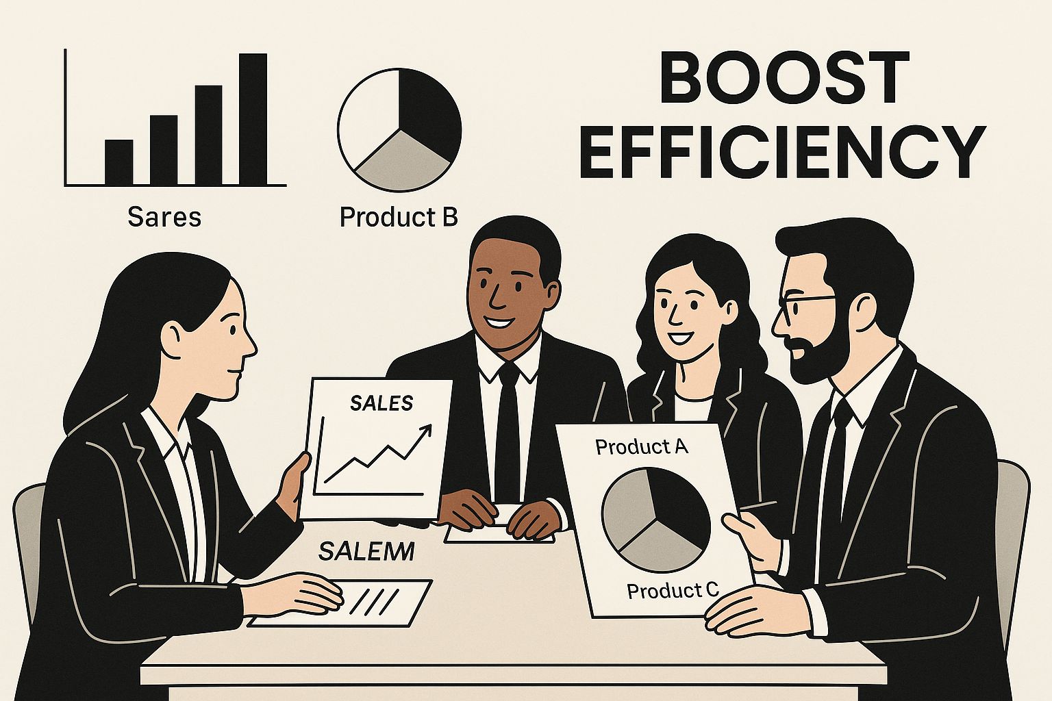
When you visualize performance this way, it's much easier for a manager to see at a glance where the team is crushing it and which areas might need a little more coaching.
To help you decide what to include, here’s a breakdown of metrics most businesses should track versus those that are more specific to certain goals.
Essential vs. Contextual Sales Metrics
| Metric Category | Essential Metrics (Must-Track) | Contextual Metrics (Track if Relevant) |
|---|---|---|
| Revenue & Growth | Total Revenue, Year-over-Year Growth, Quota Attainment | Monthly Recurring Revenue (MRR), Average Deal Size |
| Pipeline Health | Number of New Leads, Lead Conversion Rate, Sales Pipeline Value | Lead Velocity Rate, MQL to SQL Conversion Rate |
| Sales Efficiency | Win Rate, Sales Cycle Length | Lead Response Time, Calls/Emails per Rep |
| Customer Value | Customer Acquisition Cost (CAC), Customer Lifetime Value (LTV) | Net Promoter Score (NPS), Customer Churn Rate |
This table isn't exhaustive, but it provides a solid framework. Start with the "Essential" column and then pull from the "Contextual" column as needed to align with your specific business model and objectives.
Moving from Data Points to Actionable Insights
Just listing numbers on a spreadsheet is useless. Your report needs to tell a story and answer the "why" behind the data.
For instance, you might notice that your Sales Cycle Length is creeping up. By itself, that’s just a worrying number. But if you cross-reference it with your Win Rate by Lead Source, you might discover that leads from a new marketing campaign are taking forever to close. Now you have a real insight you can act on.
Here’s another practical example. Let's say your Customer Acquisition Cost is rising every quarter. The knee-jerk reaction is to panic and cut spending. But if you're also tracking LTV and see that the value of those new, more expensive customers is rising even faster, then it's actually a smart investment. Without tracking those two metrics together, you'd only see half the picture.
The best sales report template doesn't just present data; it answers critical business questions. It should immediately show where you are winning, where you are struggling, and why.
This level of analysis is what turns a report from a chore into a strategic weapon. For companies that run their own contact centers, pairing sales metrics with service data is even more powerful. Digging into the right contact center KPIs can give you a full 360-degree view of the customer journey.
By being selective and focusing on the metrics that tie directly to your goals, your sales report becomes a clear, actionable guide that your entire team can get behind.
Designing Your Report for Maximum Clarity and Impact
A sales report is more than a spreadsheet full of numbers; it's a story. A well-designed report template transforms that raw data into a narrative that guides your team, showing them where you've been, where you are, and where you're headed. The layout is everything. It needs to be clean, logical, and instantly understandable, allowing anyone from the CEO to a new sales rep to grasp the key takeaways at a glance.
The best way to start is with an executive summary right at the top. Don't make people hunt for the bottom line. This brief section should immediately answer the big questions: Are we hitting our targets? What were our biggest wins this period? What roadblocks are slowing us down? Think of it as the 30-second elevator pitch for your team's performance.

Structuring Data to Uncover Real Insights
Once you’ve set the stage with the summary, the real magic happens in how you slice and dice the data. Breaking down performance by different criteria is how you move from simply reporting what happened to understanding why it happened. This is where you find the hidden patterns and opportunities for growth.
Here are a few essential ways to segment your data:
- By Team or Individual: This is your bread and butter for performance management. It’s how you spot your top closers and identify reps who might need a bit more coaching.
- By Product or Service Line: This view tells you what’s flying off the shelves and what might need a marketing push or a pricing adjustment.
- By Region or Territory: For teams spread across different locations, this is non-negotiable for spotting market-specific trends and figuring out where to best deploy resources.
- By Lead Source: This is crucial for optimizing your marketing budget. It shows you which channels are sending you high-quality leads that actually convert.
Let's say you segment by individual rep and notice that one salesperson has an incredible win rate but a tiny average deal size. That's a powerful, actionable insight. You can now work with them on strategies to upsell or hunt for bigger accounts. Without that specific view, their overall performance might just look average.
The goal of a sales report isn't just to report what happened, but to reveal why it happened. Smart segmentation is the key that unlocks those crucial insights.
This kind of granular tracking is becoming critical, especially in fast-moving markets. For example, the retail landscape in the Middle East is exploding. With e-commerce projected to hit 16% of the retail sector in the Middle East and North Africa by 2025 and grocery sales already hitting USD 114 billion recently, businesses need incredibly detailed reports to navigate that growth. You can dig into more on the MENA retail sector on Statista.com.
Choosing the Right Visuals to Tell the Story
After organizing your data, you have to present it in a way that clicks. Our brains are wired to process images much faster than text or tables of raw numbers. The right chart can communicate a complex idea in seconds.
Here's a quick cheat sheet for picking the right tool for the job:
- Bar Charts for Comparisons: These are perfect for showing performance between reps, comparing product sales, or stacking regions against each other.
- Line Charts for Trends: Nothing beats a line chart for showing revenue growth, pipeline value, or conversion rates over time, whether it's week-over-week or quarter-over-quarter.
- Pie Charts for Composition (But Use Sparingly): They work well for simple breakdowns, like the percentage of leads from different sources, but they get confusing fast with more than a few slices.
- Tables for the Fine Details: When someone needs the exact numbers behind the pretty charts, a clean, well-organized table is essential. Pro tip: use conditional formatting to make high and low values pop.
By thoughtfully combining these elements, your sales report template becomes a genuine communication powerhouse. It ensures everyone, from a time-crunched executive to a detail-oriented manager, can find exactly what they need to make smarter, faster decisions.
Plugging Your Template into Your CRM and Other Tools
A sales report template, no matter how well-designed, is just a pretty document until it’s plugged into a live data source. The real magic happens when you connect it to the tools your team lives in every day—especially your CRM. This connection is what transforms reporting from a dreaded monthly chore into a fluid, automated part of your sales rhythm.
To get the most out of your template, integrating it with your CRM is non-negotiable. If you're not already convinced, understanding the key benefits of Customer Relationship Management will make it crystal clear why this is the only way to maintain a single source of truth for your sales data.
Let's be honest, manual data entry is a nightmare. It’s not just a time sink; it's a breeding ground for errors. One misplaced decimal or a simple typo can throw off an entire report, leading you to make strategic decisions based on faulty information. Automation solves this.
Letting the Data Flow from Your CRM
Most modern CRMs—think Salesforce, HubSpot, or Zoho—are built for this. They don't want you manually exporting spreadsheets any more than you want to do it. You just need to tap into their built-in capabilities.
- Scheduled Reports: This is the easiest win. Set your CRM to automatically run key reports (daily, weekly, whatever you need) and email them to the right people or drop them into a shared folder. Set it and forget it.
- Direct API Connections: For those who want real-time data, an API is the way to go. This creates a direct line between your systems, so your report is always a live reflection of what’s happening. If you're on Zoho, for instance, diving into a guide on the Zoho CRM API can unlock some seriously powerful custom automation.
- Third-Party Connectors: Don't have a developer on hand? No problem. Tools like Zapier or Make are lifesavers. They act as a middleman, letting you build simple workflows like, "When a deal is marked 'Closed-Won' in our CRM, add a new row to our Google Sheet."
This kind of integration is at the heart of the sales enablement movement. It’s no surprise that the MEA sales enablement platform market, which generated USD 414.8 million, is projected to soar to USD 833.3 million by 2030, as detailed in a market analysis from Grand View Research. The demand for connected, efficient systems is only growing.
The objective here isn't just about moving data from one place to another. It's about building a dependable, automated workflow that turns your sales report into a living, breathing document, not just a static snapshot in time.
Making Your Spreadsheets Smarter
Even if your template is built in a classic tool like Excel or Google Sheets, you can still automate a huge chunk of the work. The trick is to stop treating them like digital paper and start using their powerful data-crunching features.
A little know-how with a few key functions can completely transform your process:
| Function | What It Does | How You'll Actually Use It |
|---|---|---|
| VLOOKUP/XLOOKUP | Finds a piece of data in one table and pulls it into another. | Grabbing customer contact details from a master list and dropping them into your main sales report using just their account ID. |
| SUMIFS/COUNTIFS | Adds up or counts cells, but only if they meet several conditions you set. | Calculating the exact revenue generated by a specific rep, in a specific region, for the past month. |
| Pivot Tables | Lets you summarize massive amounts of data and look at it from any angle. | Taking a raw data export and instantly creating a high-level summary of sales by product, region, and team member. |
By building these formulas directly into your template, your workflow becomes simple: paste in the raw data export from your CRM, and watch the report populate and organize itself. It’s the perfect middle ground—a semi-automated system that gives you both efficiency and control.
How to Analyze Your Report and Drive Real Decisions

Putting together a sales report is one thing; turning it into a real-world strategy is another. The template is your starting point, but the magic happens when you start analyzing the numbers and asking the tough "why" questions. This is how you shift from simply tracking data to having a meaningful conversation about performance.
Don't get fixated on the big, flashy numbers like total revenue. The real story is always in the details. Sure, overall revenue might be up, but is that because one product line is killing it while others are struggling? Is a single superstar rep carrying the team, or is success spread evenly? Digging into these layers is where you'll find your next move.
Comparing Data for Context
A number on its own is practically meaningless. Is a 75% quota attainment good or bad? You can't know without context. That’s why the most powerful analysis comes from comparing your current data against different benchmarks.
Here are a few comparisons I always make:
- Period-over-Period: How did this month look compared to last month? This is your go-to for spotting short-term trends and immediate problems.
- Year-over-Year: Stacking this quarter against the same one last year is essential. It filters out the noise of seasonality, showing you whether you’re actually growing or just riding a predictable wave.
- Forecast vs. Actual: How close were you to your prediction? If there’s a consistent gap between your forecast and reality, it might mean your pipeline qualification process needs a serious look or your forecasting model is off.
When you bring this comparative mindset to your sales meetings, they stop being simple check-ins and become genuine strategy sessions. The conversation shifts from "what happened" to "why it happened and what we’re doing about it."
Asking the Right Questions
To turn insights into tangible actions, you need to develop a habit of questioning everything. As you go through your report, use pointed questions to challenge your assumptions and get to the root of your performance.
The most effective sales leaders I know don't just read reports; they interrogate them. They treat the data as the beginning of a conversation, not the end of one.
Here’s a simple framework to guide your thinking:
| If You See This… | Ask This Question… | Then Take This Action… |
|---|---|---|
| Win Rate | "Is our win rate consistent across lead sources? What about across different reps?" | Double down on marketing channels that deliver high-converting leads, or offer targeted coaching to reps with lower win rates. |
| Sales Cycle Length | "Where are deals getting stuck? Which stage of the pipeline is the slowest?" | Tweak your messaging for that specific stage, create better sales collateral, or run a training session focused on that bottleneck. |
| Average Deal Size | "Are we closing smaller, faster deals or bigger, more strategic ones?" | Adjust your sales incentives to reward the type of deals you want to see more of. |
This process of questioning, finding answers, and creating concrete next steps is what data-driven decision-making is all about. It ensures the hard work you put into your sales report template directly contributes to growing the business.
For a more immediate visual breakdown, many teams find that a dynamic call center reporting dashboard helps identify these trends much faster. By consistently analyzing your data this way, you create a feedback loop that constantly sharpens your entire sales process, from one-on-one coaching to major strategic shifts.
Answering Your Top Questions About Sales Report Templates
Even with the best template in hand, questions always pop up. How often should you actually run these reports? What are the common traps people fall into? Getting these details right is the difference between a report that drives action and one that just becomes another administrative chore.
One of the first things people ask is about timing. There's no magic number here—the right frequency is all about the rhythm of your business. If you're a fast-paced SaaS company with a two-week sales cycle, weekly reports are crucial for making quick tactical shifts. But for an enterprise company with a nine-month sales cycle, a weekly report would be mostly noise. A monthly or even quarterly view gives them a much clearer, more strategic picture.
The real key isn't the specific frequency, but the consistency. Pick a cadence that gives you data fresh enough to act on for your sales cycle, and then commit to it.
What's the Single Biggest Mistake to Avoid?
When it comes to building a sales report, the most common pitfall by far is information overload. It’s so tempting to cram every metric you can track into one dashboard, but that almost always backfires by making the report impossible to digest. A cluttered report that no one reads is useless.
A great report tells a story at a glance. To achieve that, you have to prioritize clarity over sheer quantity. I always advise starting with just 5-7 core KPIs that tie directly to your main business objectives. If a metric doesn't help someone make a specific decision, it probably doesn't need to be on the summary page.
Should Everyone in the Company Use the Same Template?
While having a master template is a great way to keep data consistent, forcing everyone to use the exact same view is a big mistake. What a CEO needs to see is completely different from what an individual sales rep needs to stay on track. The best templates are flexible enough to be adapted for different audiences.
Think of it as creating different "lenses" for your data:
- For the CEO: They need the 10,000-foot view. A high-level executive summary focused on top-line revenue, year-over-year growth, and overall quota attainment is perfect.
- For Sales Managers: They need to get more granular. Their view should break down performance by team and individual, highlighting things like pipeline health and win rates.
- For Sales Reps: This should be a personal dashboard. It needs to show their individual pipeline, activity metrics like calls and meetings, and how close they are to hitting their own quota.
By building these tailored views from a single, consistent data source, you make sure everyone gets exactly what they need to do their job well, without getting bogged down by irrelevant numbers.
Ready to build a reporting system that provides clarity and drives decisions? Cloud Move offers powerful contact center solutions with deep CRM integrations, making it easy to pull the data you need for accurate, automated reporting. Discover how our tools can improve your sales operations by requesting a free demo today.